Trendy meets traditional in this family home built from scratch.
When you’re a designer who specializes in hip eateries, it’s natural to be nervous about designing your first home, especially when it comes to the kitchen. “I definitely felt a lot of pressure because I’m known for my work in the restaurant business,” says Tanya Krpan, design director for the popular North American restaurant chain Earls Kitchen + Bar. Throw in a spouse, Jure, who happens to be a builder and a baby on the way and you’ve almost got the makings of a reality show. But this one has a happy ending: “I did most of the interior, and Jure handled the construction,” says Tanya. “We worked well together.”
That was four years ago. Now, Tanya and Jure have three children – Ivan, 3, Cruz, 2, and five-month-old Belle – to fill up the 3,500-square-foot home that was their first co-production. The five-bedroom, six-bathroom house in Richmond, B.C., represents the couple’s shared vision. “We wanted a clean aesthetic with classic elements,” says Tanya. Though this might sound like a contradiction in terms, the neutral walls and black casement windows provide a fresh counterpoint to the home’s traditional panelling and coffered ceilings.
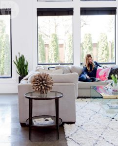
Save on accessories Homeowner Tanya Krpan (pictured here) saved on accessories by loading the family room sectional with an assortment of ready-made toss cushions.
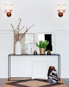
A grand entryway Tanya isn’t afraid to play with negative space, as seen in the home’s grand entryway. “Normally, you’d expect a mirror or big piece of art hanging above the wainscotting,” she says. Leaving the wall blank and layering small pieces on the console allows the millwork to shine.
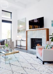
Create a contrast Black casement windows and decorative accents create contrast in the neutral space. Tanya scored the vintage coffee table when her office was being redecorated.
Creating a classic-cool mix The family room’s classic-cool mix feels right for a young family.
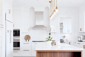
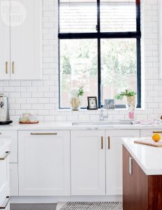
Restaurant-style kitchen The kitchen, of course, is the true star of the show. Tanya’s restaurant-design pedigree shines through in the room’s floor-to-ceiling tiles, mix of open and closed storage and high-end appliances. She opted for white Shaker-style cabinetry and warmed up the space with a walnut island and brass…
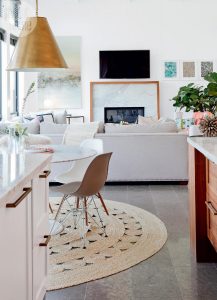
Traditional and contemporary space Another bistro-inspired touch was her choice of dark honed-limestone tiles for most of the main floor. “The tile grounds the space since there’s an abundance of white everywhere,” Tanya explains. “And it’s proven great for hiding dirt.”
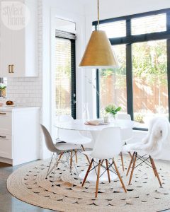
Designed for everyday life Everything in the Krpans’ home is designed for everyday life and entertaining, from the large sectional in the family room to the round tables in the dining room and the kitchen’s eat-in area. “It’s more social to sit at a round table,” says Tanya. “You see everyone’s faces.”
Copyright to the original publisher Style at home.
Sponsored by The econcierge Delivering the usual exceptionally. Get in touch with us at [email protected]


